We all know that Good Design Matters. Good design produces brand recognition and loyalty. It can lead to sales and community integration. But what about bad design? We've all seen listicles of ad fails and, sure, they're good for a laugh--but it's not hurting anyone, right?
Sadly, bad design can and has been an agent for harm. Take a look at these case studies.
Case Study: Hawaiian Missile Crisis
Back in January, Hawaiian citizens received a text message from the Hawaii Emergency Management Agency. The text read: "BALLISTIC MISSILE THREAT INBOUND TO HAWAII. SEEK IMMEDIATE SHELTER. THIS IS NOT A DRILL."
Of course, panic ensued. Frantic calls to loved ones, climbing into manholes, and driving at high speeds—only, it was meant to be a drill after all.
The HEMA employee merely selected the wrong menu option. Let's take a look at what they saw and break down the design flaws.

Design Problems:
- Lack of hierarchy
- Inconsistent language
- Lack of follow-up/crisis control plan
"The naming and order of each link seem to me to be the biggest problem," says Landon Dorrier, web developer here at The Ivy Group. "They're all very similarly named and given the same weight even though the resulting action carries vastly different consequences."
The link for "1. TEST Message" appears to be a header, making all the following links look like they are all tests. In an abbreviation-filled menu like this, consistency is key. You don't have to create an entire design system to properly format a list.
An issue ignored is a crisis ensured.
Of course, human error exists in the best design scenarios, so when stakes are this high, it's not just the front-end appearance that matters. A click-to-confirm that spells out the action ("Are you sure you want to send a missile warning?") or a two-person verification, which HEMA now plans to add, could have prevented this error.
Additionally, the alert system had nothing in place to alert citizens of a false alarm. HEMA has since added this option, but because they had to scramble to create it, Hawaiian citizens were in panic mode for a full 25 minutes.
Case Study: Palm Beach Ballot
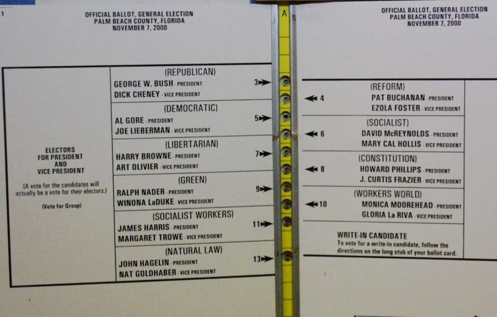
Many remember the infamous 2000 election, when a third-party candidate finished with nearly 2,700 more votes in Democratic Palm Beach County than in any other Florida county. Additionally, over 19,000 ballots were thrown out because they were invalidated by multiple votes. Several have gone so far as to say that this single county's vote cost Al Gore the presidency.
And what caused this political disaster? Bad design.

Design Problems:
- Misalignment
- Unnatural flow
- Importance of usability testing
In order to fit all the candidates and their information, the ballot is designed with a "butterfly" layout. Unfortunately, this layout is uncommon enough to confuse thousands of voters. Rather than going straight down the page, the user is expected to switch from the left page to the right page and back again. While the arrows are an attempt to guide the user's eye towards the proper punch hole, the dividing lines between candidates lead the eye more directly to the incorrect punch holes.
Case Study: Miss Universe 2015
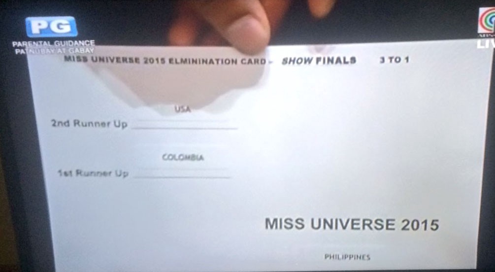
We all know what happened here...Steve Harvey announced the wrong winner at the Miss Universe pageant in 2015. A very confused Miss Colombia was crowned and suddenly dethroned in the space of a few minutes. But perhaps a closer look at Steve Harvey's prompt card will help us understand his mistake.

Design Problems:
- Small font
- Unclear flow/hierarchy
- Confusing terminology
- The importance of practicing before you present
Arguably, this card need not feature fancy, branded design, as it was never meant to be viewer-facing. However, design is about functionality as much as aesthetic. The layout here is murky. A simple color code (red for the runners up, green for the winner) could have helped Mr. Harvey see the winner more clearly.
Let's go a step further: the naming convention itself is confusing. Mr. Harvey saw "1st" and in the moment thought it denoted the 1st place contestant, the winner. It would be clearer to have written "3rd place," "2nd place," and "!st place," or "winner."
Even if this terminology should be overhauled, naming the 2nd place contestant the "1st runner up" is customary for pageants like this, and we should never take practicing for granted. Know what to expect when giving a presentation!

Bad design is everywhere; good design is invisible.
As the saying goes, "bad design is everywhere; good design is invisible." Sometimes #designfails only harm your brand (like this ad that seems to show a plane crash), but every so often they harm others, too. Want to avoid making large-scale mistakes? Start with our Good Design Matters series.
Category: Design
Tags: design, good design matters
