Sometimes we get complacent in our user interfaces. A bad idea can take root, whether because of technical constraints or poor planning, and become accepted over time because "that's the way things are". Think the QWERTY keyboard,microwave controls and parking brake release levers.
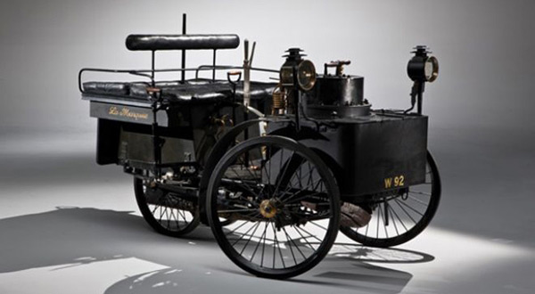
I read an article yesterday about a vintage 1884 automobile going up for auction - the De Dion Bouton Et Trepardoux Dos-A-Dos Steam Runabout. It's the world's oldest working auto, or second-oldest depending on whom you ask, and a real treat for the eyes. All of the major moving parts are still recognizable to a non-car savvy person: rear wheel drive, headlights, rubber tires, padded seats and what looks like a suspension system. Under the right conditions, it could get up to 37 miles per hour and successfully completed a circuit from Paris to Versailles and back (19 miles, averaging 16 mph). Pretty impressive for a steam boiler on wheels!
What interested me about the De Dion was, in today's idiom, the user interface. There's not a steering wheel, acceleration pedal, speedometer or ignition switch to be found. Since the De Dion is powered by a coal-fired steam boiler, you'd expect some differences in the control setup, but its configuration is alien even to the Model T! This is a great illustration of how user interfaces evolve over time in response not only to changing technology but also to user preference and the whims of an engineer.
The De Dion throttle, steering, brake and a few other inscrutable levers are all controlled by hand. You can imagine the driver furiously moving his hands from one to the next, veering around wagon ruts and powering up hills. At what point did the automotive engineer decide to move some of the controls to the floorboard? Were the steering controls ever moved to the floor, as in an airplane's yaw pedals?
Our challenge as web developers and designers is to give the user intuitive control over all aspects of the system that they require and no more. The user needs to "feel" in control but also be secure that they won't mess anything up through ignorance or carelessness. The administrative console for a website has to feel sufficiently similar to the live site that the admin user is comfortable in adding and editing content.
We are beginning the redesign of our in-house system Mimik IMS with these factors in mind. We're critiquing and evaluating not only the current version of Mimik but also WordPress, Drupal and other CMS products to figure out which interface design models make a really usable website management tool and which models should go the way of the handbrake and spade handle steering levers!
Category: Web & Technology
Tags: content management, web, wordpress
