Piedmont Housing Alliance creates affordable housing opportunities and fosters community through education, lending, and equitable development. Inspired by the organization's commitment to "Housing for All", we designed a new brandmark and website that embodies a spirit of optimism and an ongoing commitment to inclusivity and equity.
Messaging strategy centers on stories connect with donors and program participants.
Given the post-August 2017 climate in Charlottesville, Piedmont Housing's leadership in affordable housing and racial equity are more important than ever. Not to be confused with the Charlottesville Redevelopment and Housing Authority, the nonprofit takes a holistic approach to improving financial outcomes through affordable housing solutions. Prior to the rebrand, Piedmont Housing’s branding and messaging did not accurately reflect its vision, mission, and services.
It's critically important that our identity, externally and internally, aligns with our mission, growth, and goals. In this spirit, we are excited to refresh our branding and messaging so that everyone clearly understands the important work we do on a daily basis.
Sunshine Mathon, Executive Director
When addressing donors and decision-makers, Piedmont Housing employs persuasive, data-driven language to emphasize the connection between safe, affordable housing and larger societal challenges. For current and prospective clients, encouraging and respectful communications center on Piedmont Housing services that help people overcome obstacles and achieve their life goals.
Regardless of the audience, the focus is on storytelling. Narratives of personal challenges and triumphs are crafted to build emotional connections and illustrate Piedmont Housing's contributions to successful outcomes. A good rule of thumb: success stories—benefits of Piedmont Housing programs—should be emphasized over programs or products.
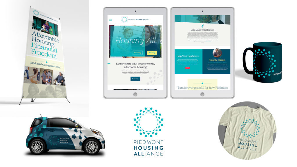
New brandmark embodies a spirit of optimism and an ongoing commitment to inclusivity and equity.
A preliminary materials audit showed that, without brand standards, colors and fonts were used inconsistently—not the most professional presentation and a challenge to recognition. And the outdated logo's patriotic red, white, and blue colors suggested Piedmont Housing was a government agency.
The refreshed brand presentation is all-encompassing and celebratory. The two circles of houses enclosing an inner ring of rooflines convey Piedmont Housing's ongoing commitment to equity and community development from the inside out. The rings also suggest a ripple effect: while work often starts with individuals close to home, the mission expands outward, impacting other communities and community partners.
My challenge was to create a unique mark that accurately represents Piedmont Housing but stands out in a sector saturated with logos depicting houses and people.
Stephen Burden, Designer
Redesigned website incorporates the new branding into a professional, energic design.
Custom website development for piedmonthousingalliance.org needed to demonstrate clearly the three facets of Piedmont Housing—property management, housing counseling, and development of new affordable housing units—and how the organization carries out those services in accordance with core values.
The new site improved functionality in several key areas. To funnel two key audiences to the most relevant actions, prominent buttons above the primary navigation point to the counseling intake form and donation page. A colorful email sign up in the site footer invites users to subscribe to the newsletter. Sitewide search allows users to quickly find what they're looking for. The news section displays recent articles and is easily filtered by topics and date published. Finally, a robust education and resources center houses information on a variety of housing, lending, and other service opportunities.
As with all Ivy Group web development projects, the custom-designed site was:
- structured with effective, intuitive site architecture to provide the ideal user experience;
- optimized for rapid page load, search engine visibility, and social media shareability;
- tested for ADA accessibility, mobile responsiveness, and browser compatibility; and
- integrated with WordPress CMS to allow non-technical staff to manage site content.
When it came time to hand over the keys to the new site, we trained Piedmont Housing staff on managing their new CMS and web content best practices.
Housing all for generations to come.
The vision of Piedmont Housing Alliance for redressing inequities is holistic—bricks and mortar redevelopment, financial literacy, early childhood education, and family support services. By engaging hearts and minds, dynamic branding, evocative messaging, and a user-friendly website become the "force multipliers" for community engagement, advocacy, and fundraising.
Category: Brand Work, Web Work
Tags: branding, Charlottesville, design, logos, nonprofits, website development and support