Since its founding in 1950, the Society for Public Health Education (SOPHE) has made vital contributions to the professional development of public health educators and promoters. It supports scholarly publications, coalition-building, scholarships, continuing education, and health promotion.
Even the best and most impactful organizations, though, face difficulties as they navigate a shifting social and technological landscape. When SOPHE needed a partner to refresh its image and reinvigorate its membership, Ivy stepped up. We created a new, fully-custom website, performed an extensive brand audit, and then completed a brand identity redesign.
Ivy bolstered SOPHE’s existing brand with an updated site design
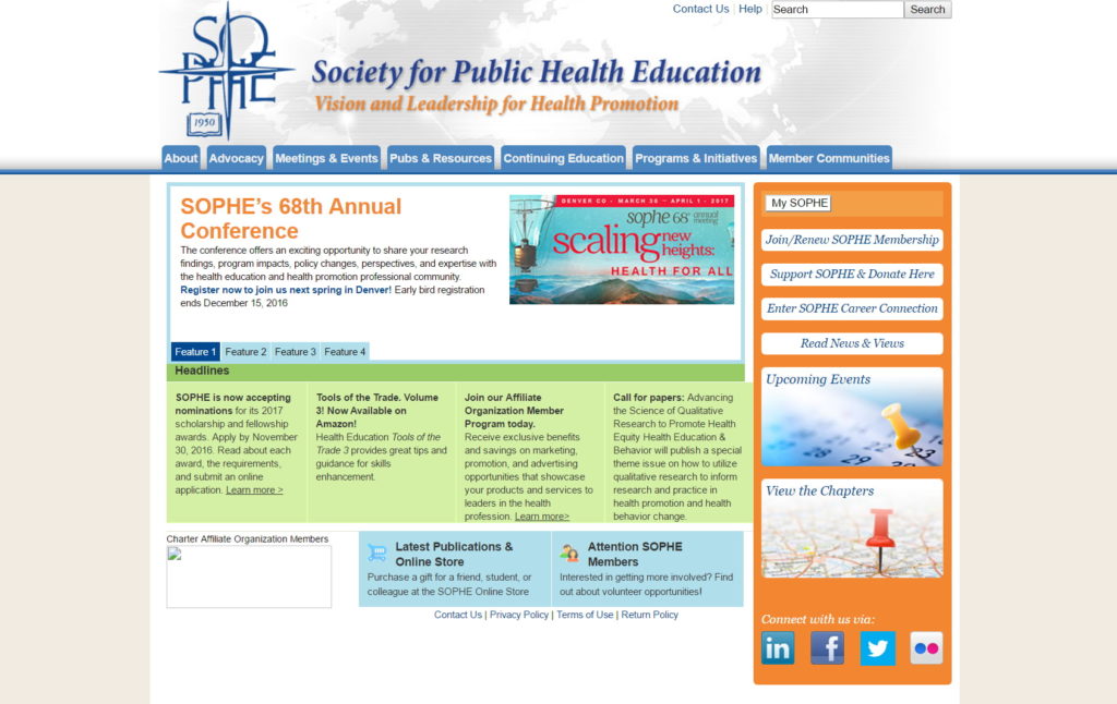
SOPHE initially came to us seeking a contemporary digital platform. With a history, name, and even logo dating back almost seventy years, SOPHE wanted a website which could preserve its history while appealing to prospective members, sponsors, and advocacy partners.
Our designers began creating the look for an established, yet progressive association
The best designs come down to a few main factors: clear direction, thoughtful preparation, and accurate color, type, and form. With one eye on SOPHE's existing brand and the other looking forward, our designers merged modern with traditional in both the site presentation and color palette.
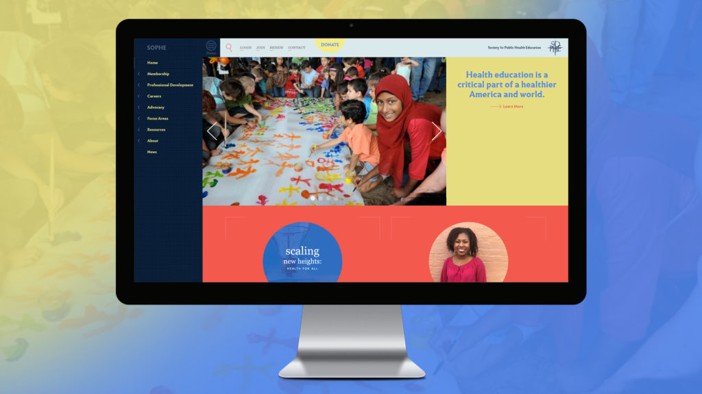
The site layout prioritizes content, bringing it front and center on the homepage for easy access to current information. A rotating banner of organization happenings dominates the "top fold" of the site to keep members up-to-date on events and networking opportunities. Upon scrolling, users see previews of features and articles, which underline SOPHE's position as a thought leader in the public health space.
SOPHE kept its "brand" blue but collaborated with Ivy on a vivid, new color palette. Ivy designers also incorporated a new calligraphic, sans-serif typeface to balance a traditional and modern aesthetic. The aesthetic needed to appeal to students and young professionals, as well as long-time members. Legibility, too, was a major factor in the choice.
"I felt [the Sandrine Nugue typeface] offered a depth and authenticity to the visual language, which was in line with SOPHE's ethos."
Stephen Burden, Ivy Graphic Designer
WordPress CMS blended unique and usable for users and content managers alike
SOPHE users are diverse and have varying levels of familiarity with technology. It was critical that the site structure be intuitive and accessible by all devices.
Traditionally, users look for a navigation bar at the top of the page. With a mobile-first mentality, we placed the navigation bar to the left of the content on desktops to better accommodate a larger menu and longer page titles. This placement enables users to scroll through eye-catching content while maintaining easy access to other pages.
We also provided the site's content managers flexibility by building SOPHE's site in the WordPress content management system (CMS). Why WordPress? This CMS enables content managers to easily edit page content, publish news articles and events, and manage sponsor ad campaigns, all in one neatly organized back-end portal.
Here's what Brigitte Johnson, APR, MSM, Health Communications & Technology Manager at SOPHE, had to say about working with us in 2017:
"Working with The Ivy Group was one of the best experiences in my career. They spent the time and effort getting to know our organization and our members. They recognized the challenge in developing a website to meet all our objectives—and they succeeded."
A SOPHE brand audit paves the way for a brand new look
The next wave of our partnership began when an initial SOPHE task force concluded that SOPHE should proceed with a rebranding study.
In came a second task force to oversee Ivy's undertaking of the study from May to September 2019. This dual-purpose research aimed to assess brand perceptions and equity amongst stakeholders. Additionally, Ivy sought to evaluate naming opportunities and confirm or refute key factors that affect member retention.
We supported this study with industry reports, competitive reviews, as well as primary research of SOPHE members and stakeholders, including online surveys, focus groups, and interviews.
While long-time members and professional collaborators recognized SOPHE as a valued and effective partner in advocacy and policy development, the research revealed that visibility and communications were problematic.
Across the board, but particularly among the younger cohort, people found it difficult to articulate the benefits of their SOPHE membership.
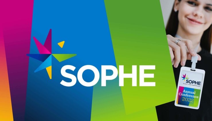
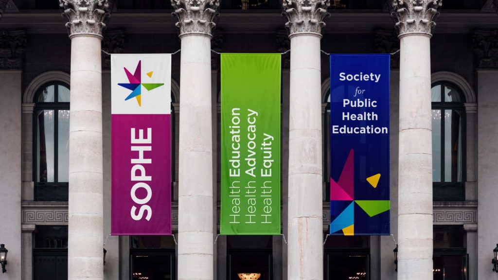
The universal consensus, though, was that the association was long overdue for a rebrand. SOPHE's monochromatic brandmark—unchanged since 1950—did nothing to communicate the association's vibrancy or eye to the future. A new look would better position SOPHE against both direct and indirect competition. And it would help support membership goals.
Rebranding became the first step toward reengineering all SOPHE communications.
SOPHE and Ivy set off on the road to rebranding
In the third wave of our partnership, Ivy worked with the SOPHE Rebranding Task Force to update the mission statement, craft a meaningful and descriptive tagline, and develop the new visual identity. This undertaking included facilitating planning sessions with the task force, as well as conducting milestone presentations to the SOPHE Board.
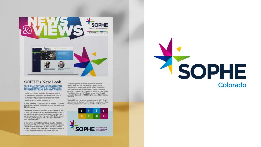
SOPHE's updated brand is bright and colorful, reflecting the innovation, momentum, and vibrancy of the association. Still grounded by the SOPHE blue, the brand introduces an otherwise brand new color palette. The rich variety of colors signifies a focus on diversity and equity, as anti-racism is now one of SOPHE's primary focus points. This reinforces accessibility for all in the public health education space.
Even with its striking colors and new design, the compass evokes the original logo. Maintaining the compass signals that SOPHE is a guide in the health education space. It also alludes to the overarching themes of longevity and reliability.
Longevity because the compass (invented in the 12th century) continues to stand the test of time. And reliability because our survival depends being able to navigate our current situation.
Continuing Support
From 2017 to now, SOPHE experienced an evolution in its brand, digital presence, and messaging, with each change contributing to its goals of promoting healthy behaviors, communities, and environments across the globe.
Ivy Group is proud to continue providing design support, technical maintenance, and analytics reporting to this inspiring organization.
“The Ivy Group adheres to deadlines but is flexible when a client needs extra time with planning and implementation…. [T]hey value the relationship they build with their clients. They are always available to answer questions and help with other projects. I highly recommend The Ivy Group and I cannot wait to work with them again."
Brigitte Johnson, SOPHE’s Health Communications & Technology Manager
Category: Brand Work, Web Work
Tags: branding, design, logos, nonprofits, print collateral, research, website development and support