Have you ever been approached by an offer to design your website, flyer, or logo? Did you think "why pay someone else to do it when I can do it for free?"
It's tempting to jump onto Canva and do it yourself, but the truth is that design is more than just tools. It takes an understanding of space, color, hierarchy, and typography. We all know that design sells, so we're kicking off a Good Design Matters blog series to help you make decisions that are not just aesthetically pleasing, but practical and conversion-oriented. Here are the top five tips we give our clients when they choose the do-it-yourself route.
Protect the Logo
A logo is your brand! Especially when starting a new campaign or advertising in a way you never have before, the logo needs room to breathe and be itself. If there are logo iterations, such as an all-white version or alternative colorways, consider what will complement the rest of the imagery.
Logo basics:
- Ensure there is enough "white space" around the logo
- Do not put the logo over a busy background
- Never stretch or squash the logo

Establish a Clear Hierarchy
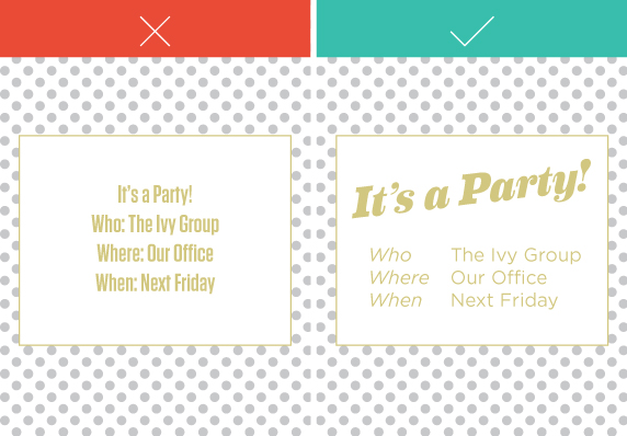
There are lots of ways to establish emphasis in design--add bold, differentiate colors, italicize, enlarge… The important thing is that not everything can be emphasized. Emphasizing too many elements at once makes for a messy image and will only confuse the viewer. Think carefully about what you want the viewer to notice first: is it a statistic, a date, a clever headline? Give whatever is most important the loudest spot on the canvas, and scale or treat the remaining information accordingly.

Work within the Design System
A design system--which includes fonts, colors, and shapes--establishes consistency across all materials. A strong design system benefits your brand by identifying new marketing pieces as belonging to the known brand. It also shows users that they haven't left a website after clicking through several links.
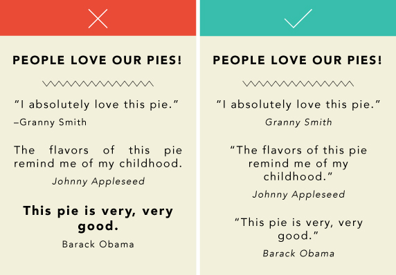
A designer should create a brand standards handbook for other creatives to refer to when style questions come up. For example, if you choose to always present quotations in bold, make that your thing! Don't use bold in the first paragraph and italics in the next. Even if "cleanliness is next to godliness" isn't your philosophy when it comes to your living room, it should be when it comes to your design.

Use Typography to Communicate Brand Personality
Typefaces can be streamlined for quick and easy reading, or complex and detailed, drawing in the viewer and forcing them to spend time with the piece. When selecting fonts, follow these guidelines:
- Limit the number of fonts used on a single piece
- Consider everywhere the fonts will be displayed: a website, the side of a bus, business cards, etc.
- Ensure that the font is legible
- Match the font's personality to the brand and the piece's message
Typefaces say a lot about a company, brand, or product and can communicate what a marketing piece is about before you even read the text. Keep personality and consumer expectations in mind when selecting a typeface. For example, a swirly and cute font with hearts dotting the "I"s does not communicate the qualities of a traditional bank, which should instead be perceived as established, safe, and professional.

Be Selective with Color
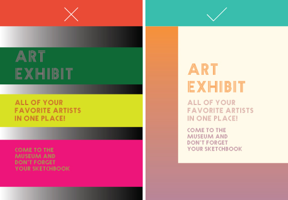
Again, less is more! Color is another opportunity to look to competitors: are they using flashy, bright, attention-grabbing colors? Even if they are, the successful ones probably aren't using more than two or three. Not everything has to be neutral and minimalist, but make sure the colors agree with each other and with the product or service being advertised. (Do some color theory research if you aren't sure). Always do a test print to make sure the colors match, and keep in mind that print and digital output may differ.

The Bottom Line on Design
The ultimate rule of thumb when working on a design project is to give yourself more time than you think you need, especially if you're a beginner. Even the simplest of designs can include layers of graphic effects, or have taken hours of careful alignment and critical editing to get right. It's worth it, though: good design matters.
Category: Design
Tags: branding, design, good design matters
