An often-overlooked part of a website is the "404" page, a standard error message page letting the user know that they've come to a URL that doesn't exist.
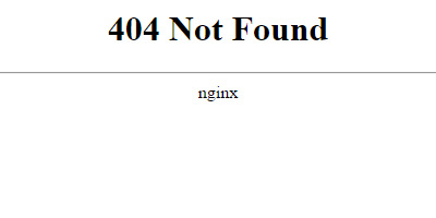
Sound boring? It doesn't have to be! If done well, a 404 page shows your commitment to a positive user experience, retains the user, and puts a smile on their face.
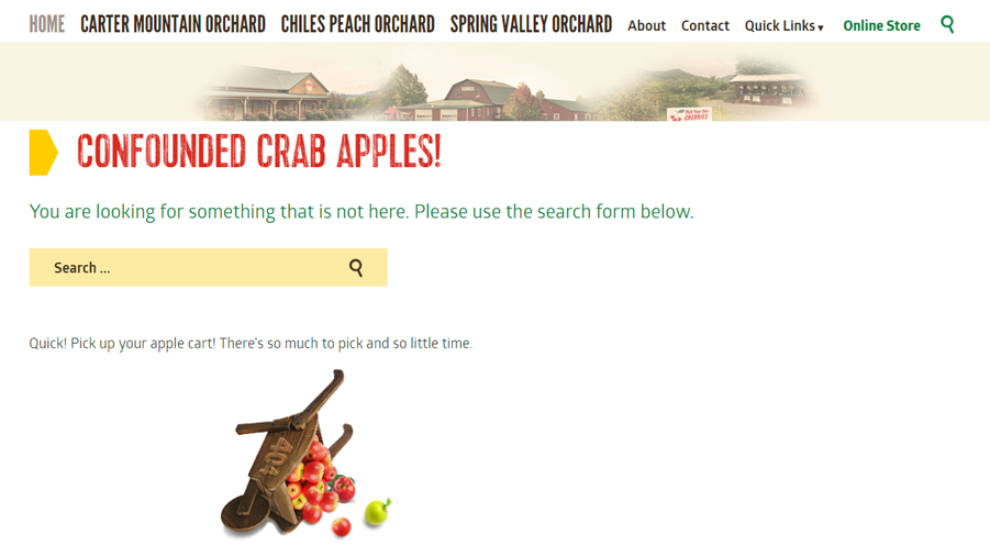
1. Explain the Error
It's likely that your site visitors do not understand the meaning of the 404 error code. Explain to the user in plain language why they are seeing this page. Your descriptive text might include:
- The link you followed may be broken
- The page may have been removed
- We couldn't find that page
- That page doesn't exist
Providing context for the error code helps the user to understand why they encountered the error. Hopefully, it will also lessen their frustration at experiencing the error.
2. Redirect the User Within the Site
Now that your user understands the error, help them figure out what to do next.
A website visitor is a guest in your virtual home. Don't let your error page make them feel unwelcome! Instead, encourage them to stay awhile by offering alternative paths to find the information they seek.
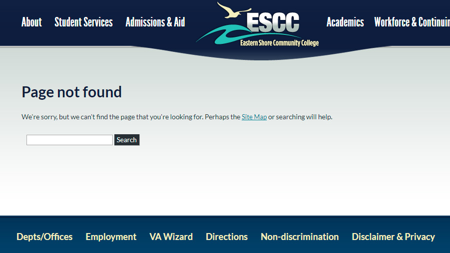
A search field will give your users the greatest sense of control if they're on the hunt for something specific. However, if your users are primarily on your site to browse, help them out by providing starting points. Keep the list of links simple and brief: resist the urge to provide a link to every nook and cranny of your site. A good rule of thumb is to limit it to four or five links, which will allow users to progress through your site without being overwhelmed with options.
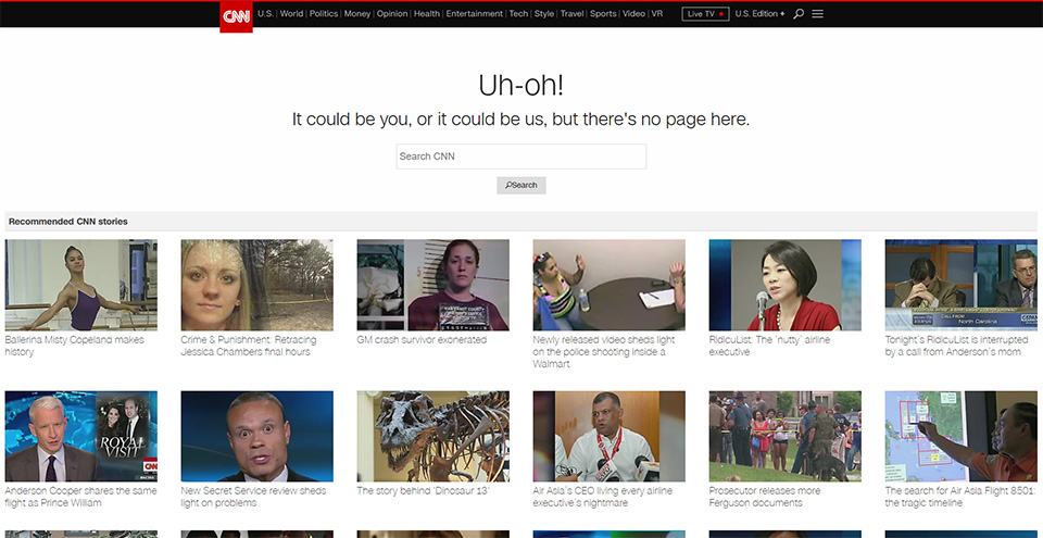
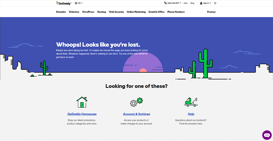
3. Show Some Personality (In Brand)
Running into a 404 page is a downer, and there isn't always something you can do about it. Users type in the wrong URL and web pages always have the possibility of being removed. It's a fact of life on the world wide web.
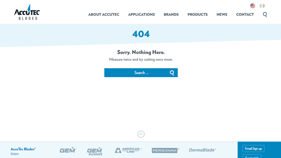
Don't rely on a jarring default 404 error page. Instead, you can make this error a little less of a bummer by injecting some creativity. Give your user a smile in an otherwise no-fun situation. Just make sure that your creativity is still in line with the rest of your site's style and tone.

4. Be Proactive
The only thing better than a well-designed 404 page is knowing you've done everything you can to prevent users from coming across it in the first place!
Find the Problematic Links
You can use Google Analytics to find 404 errors caused by both internal and external links. Armed with that information, you can fix the offending internal links and set up 301 redirects for commonly misspelled or misused URLs. Google Search console can also show you the 404 errors found when Google crawls your site.
Set Up 301 Redirects
Web pages may be removed from time to time: it happens. Upon removing a page, create a 301 redirect in your .htaccess file to redirect anyone who attempts to reach that page in the future to a different page of your choosing.
Did You Know?
Built into WordPress is the ability to auto-correct a nonexistent URL if the URL slug is a close enough match to the real slug. For example, the incomplete URL ivygroup.com/blog/charlottesville-marketing will still take you to the correct URL ivygroup.com/blog/charlottesville-marketing-and-design-agencies.
Bonus
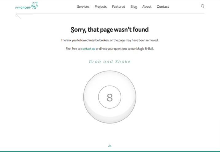
There was nothing wrong with our old 404 page, but while putting together this blog, we decided to step up our game. Check out our new entertaining, interactive page!
Category: Web & Technology
Tags: branding, websites
