Change is in the air at Ivy Group. From new ownership and a growing team to a return to in-person work and upping our office coffee game, 2021 has been an exciting year of transition. We've triumphed over 2020's bumps and bruises and embraced change around every corner, a fierce determination that's not stopping anytime soon.
From this re-invigoration, some soul searching, and a whole lot of business planning emerged a clear next step: an Ivy Group rebrand. After years of providing exceptional design services to the Charlottesville community and beyond, the shoemaker finally made some shiny new shoes for her children.
Outgrowing our old look
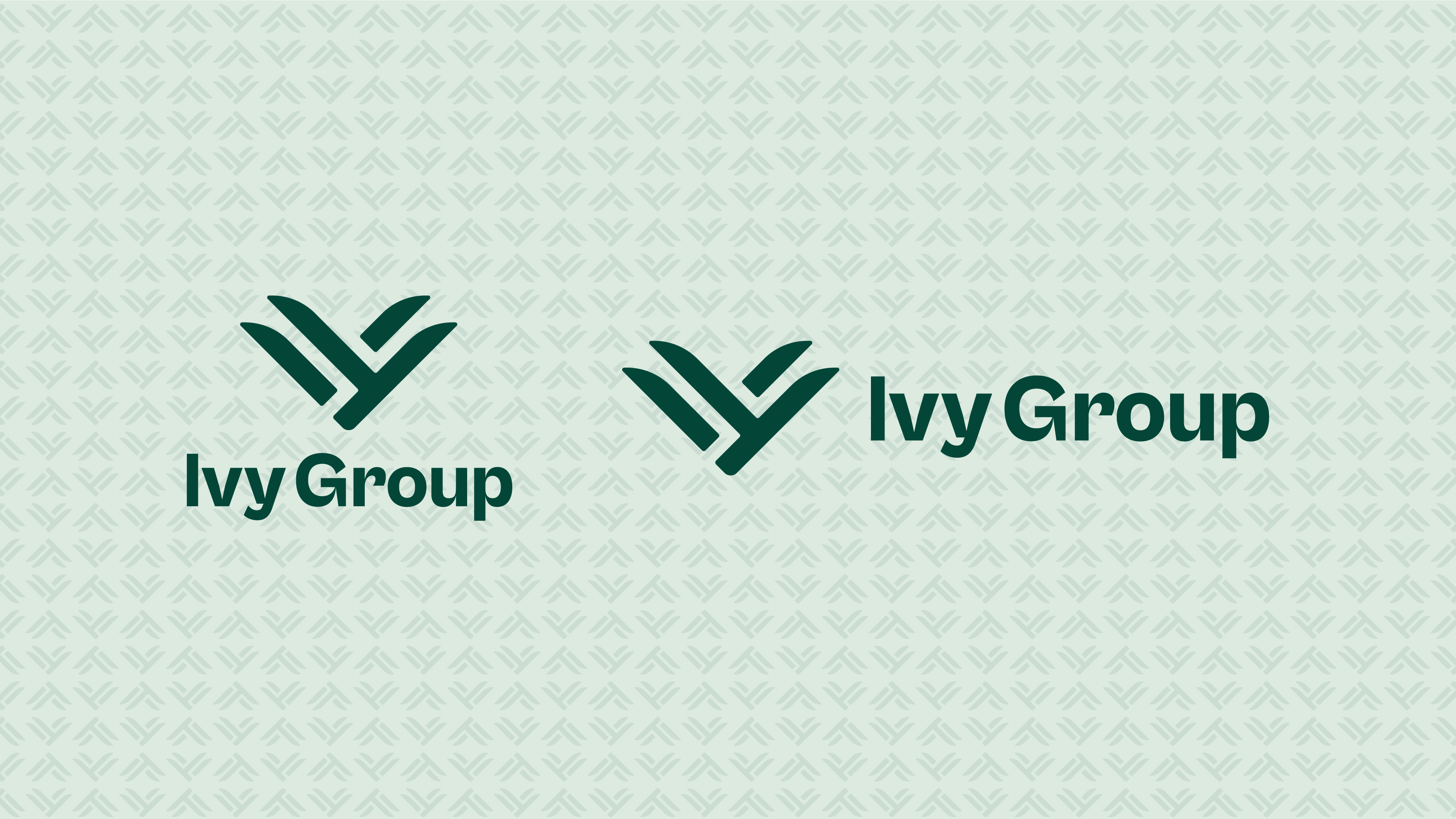
To start things off, we conducted visioning exercises and brainstormed what Ivy Group means to our team and partners, and how that meaning has evolved since our inception. While there's a lot to love about our previous logo, it no longer fit quite right with how we see ourselves.
Our Groupies are savvy, robust, and reliable problem solvers who thrive while doing good work for good people. We're proud to be the go-to Charlottesville marketing agency and count ourselves fortunate to partner with purpose-driven organizations across the country. With our updated mission in mind, we're focusing on clients with similar values: our fellow women-owned and family businesses, health-minded organizations, educational institutions, public libraries, and Virginia's manufacturers, to name a few.
Luckily, in the hands of a talented graphic designer, a logo is means of visual problem-solving. Ivy’s rejuvenated brandmark reflects our strategic yet versatile approach to navigating these collaborations and team Ivy's productive energy.
Same soul, new style
Growth is a guiding theme that influences everything we do for our clients, ourselves, and the communities we serve. The new Ivy icon symbolizes growth and the many pathways to achieve it, shown through both the solid shapes and the whitespace between.
Simple in shape, yet complex in meaning, the new Ivy Group logo can be interpreted in many ways. Take a closer look, there's plenty to see here. Some may notice our historic roots in an ivy leaf, others a plant, a jewel, open hands, birds. And those with a real eye for detail may spot the letters "I-V-Y".
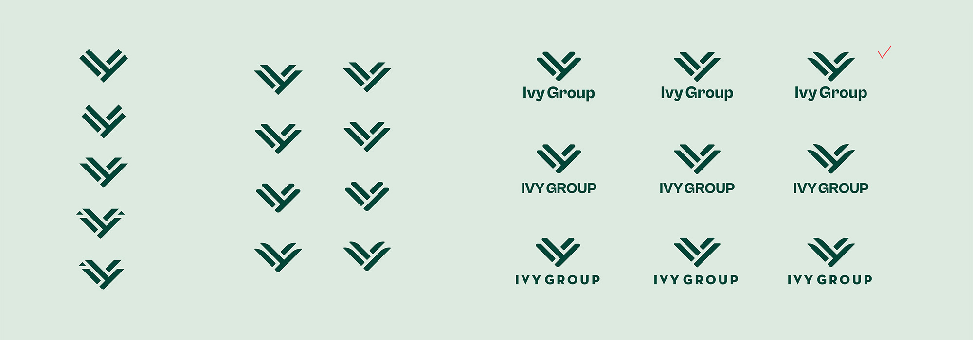
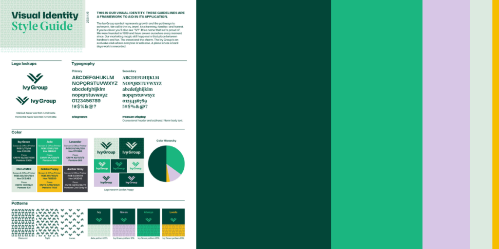
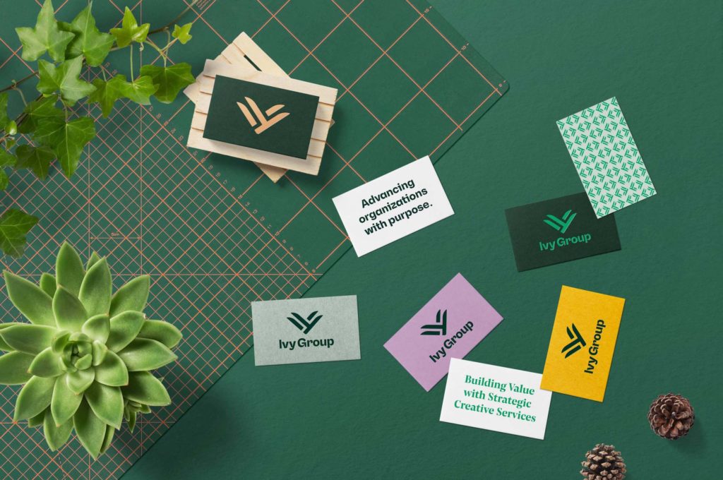
Symmetrically strong, like a capstone, the shape signals the agency's reliability yet isn't too rigid, thanks to the soft edges and unique flares. The logo is grounded yet fights stagnation by expanding upward and outward. It's elegant, playful, and abstract without being over the top. Plus, it can be easily drawn by hand, which is a bonus in the checklist of what makes a logo design good, according to our designer, Stephen.
The typeface is unique and legible, with a friendly, less corporate mix of upper and lower case. The whimsical G has an arrow in it, a literal sign of the agency's momentum.
Strengthening our roots
We were founded in 1989 and have proven ourselves every moment since. Our marketing magic still happens in that place between hard work and fun. The sweat and the charm. The Ivy Group is an exclusive club where everyone is welcome. A place where a hard day's work is rewarded.
Thirty-some years young, and we're excited to continue growing our boutique marketing agency. This year, we welcomed two additions: Kristen Koch as Copywriter & Social Media Manager and longtime client Kathy Kildea as Marketing Manager. With a talented team, re-energized mission, and swanky new look, we're exactly where we need to be to help communities thrive.
Category: Culture, Design
Tags: design, Ivy Group Team
