A logo is a brand's distinctive signature. It's a shortcut reminder of past experiences. It evokes, rallies, and motivates. Good logo design is the "picture worth a thousand words".
Informed Exploration
There's no more suspenseful moment than when designer first puts pencil on paper (yes, best to start that way!). All the research and planning and messaging and positioning must be synthesized into a memorable and unique "mark". A logo must communicate a great deal in the micro-second a consumer will give it. Talk about pressure!
It all begins by understanding the market, intended audience, and image that your organization wishes to project.
Good design takes time: wide-ranging exploration must happen before homing in on the best. Since good ideas often emerge from bad ideas, designers know to embrace the process.
Global Alliance has an esteemed legacy for addressing social justice, but the well-established organization needed to take a bold step forward to attract a whole new generation of customers. The dynamic, parallel and intersecting lines of the new logo represent forward-thinking energy and the nonprofit's role as convener and synthesizer.
Deceptive Simplicity
The world is a busy place. Consumers are exposed to over 4,000 ads every day. With so many brands fighting for our attention, distinctive design is critical. That does not translate into elaborate—in fact, often the opposite.
A logo's simplicity may spark the thought, “I could have done that too.” Not so. Each line and curve are carefully calibrated for the desired effect. Here are some of the technical considerations behind good logo design.
Proportional
Foremost, the proportions must be correct. Misalignments and features out of balance are glaring. Trained eyes will also catch poor kerning or letterforms. Careful choice of typography is a graphic designer's secret weapon, and subtle alterations to a letter's shape can make a big difference.
Scannable
Can you actually read the words? Or if the logo is a standalone icon, does it project a logic and meaning that doesn't require a lot of explanation?
Scalable
A logo should be as readable and distinct on a pencil or a billboard. It should also work across applications, whether a printed brochure, digital ad, or embroidered shirt.
Not Reliant on Color
Practicality cannot be ignored. A test of good logos is whether they retain impact and clarity in a single color and grayscale. Full color is a value-add.
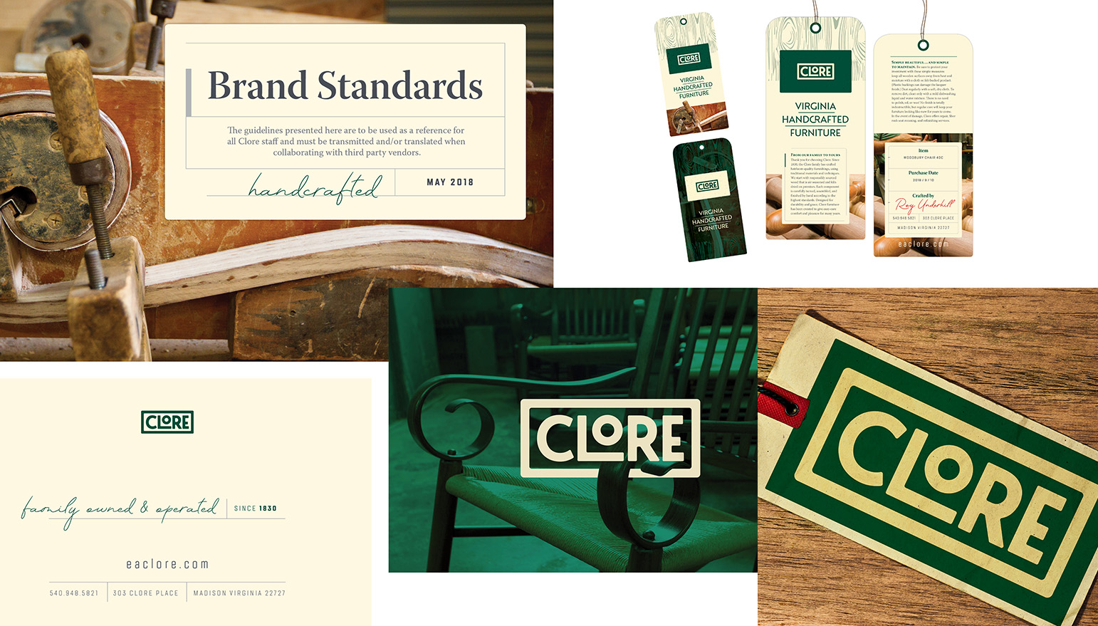
Classic, unadorned, unmistakable—that's the Clore brand. Just like the artisanship of their handmade furnishings, we redesigned the Clore logo to convey confident, sturdy quality. The logo is easily reproduced on any media, whether it is embroidered on a hat, wrapped on a delivery van, or stamped onto a piece of furniture.
Form and Function That Tell a Story
Logo development is both art and craft, a work of architecture and a feat of engineering: it has to look good and communicate clearly. It takes a thoughtful and creative exploration of line, color, font, icon, and illustration but must also carry the weight of meaning.
Good logo design is the culmination of a narrative that communicates a theme to an audience. It may not always be explicit, but it is explicable.
All in all, this interplay of aesthetics and messaging is what makes a logo good. The development process demands reciprocity between visual form and core brand attributes—the same kind of productive back and forth that happens between designer and marketer and agency and client.
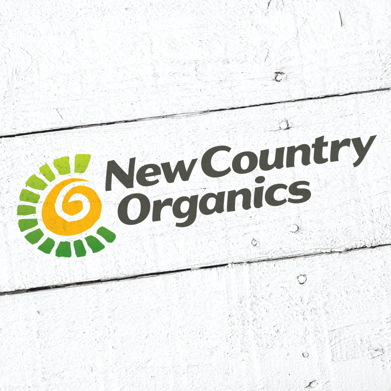
The New County Organic logo's golden spiral sits at the center of orbiting green obelisks. The colors are primal: sun, earth, soil, and life. But look more closely: the spiral represents the Fibonacci sequence, often called the Golden Ratio. This renowned code is found everywhere in nature from sunflowers to pineapples. Accordingly, it’s a fitting centerpiece for a company whose core ethos is environmental responsibility.
Wondering what the value of a logo is? Read our Avoiding the $1 Logo Trap blog.
Respect for Standards
We won't belabor the importance of graphic standards, but what's the point of having a good-looking, meaningful logo unless it’s delivered consistently? 'Nuff said.
Category: Design
Tags: branding, design, good design matters
